

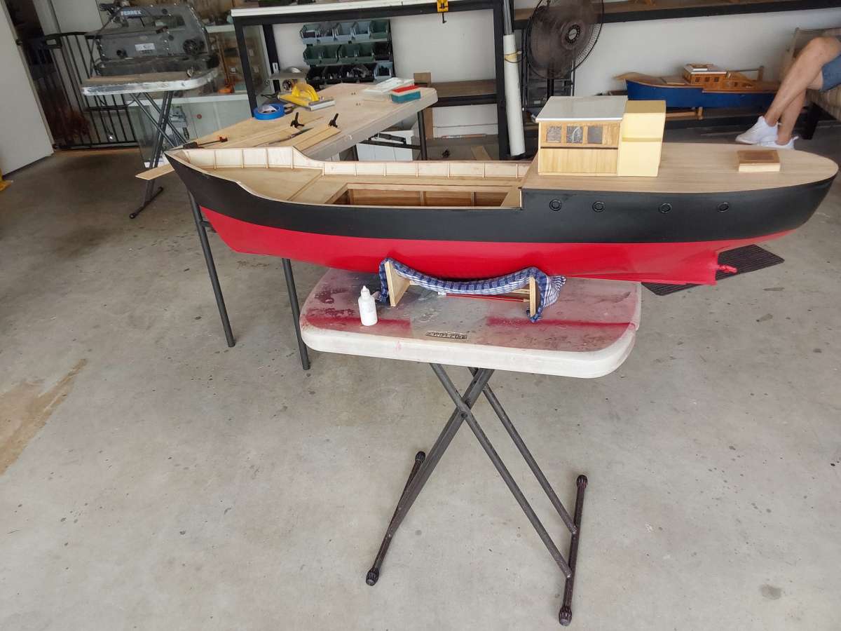
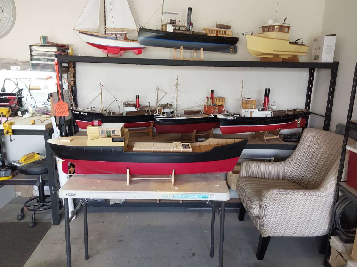
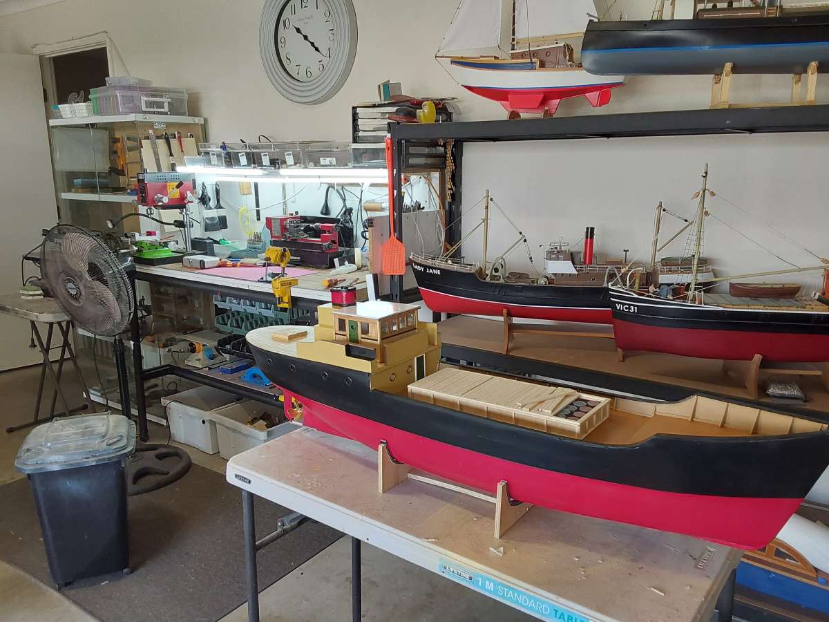
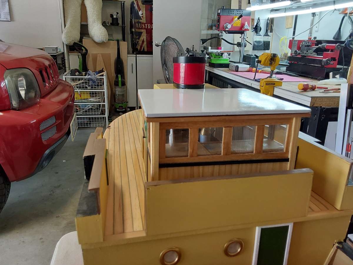
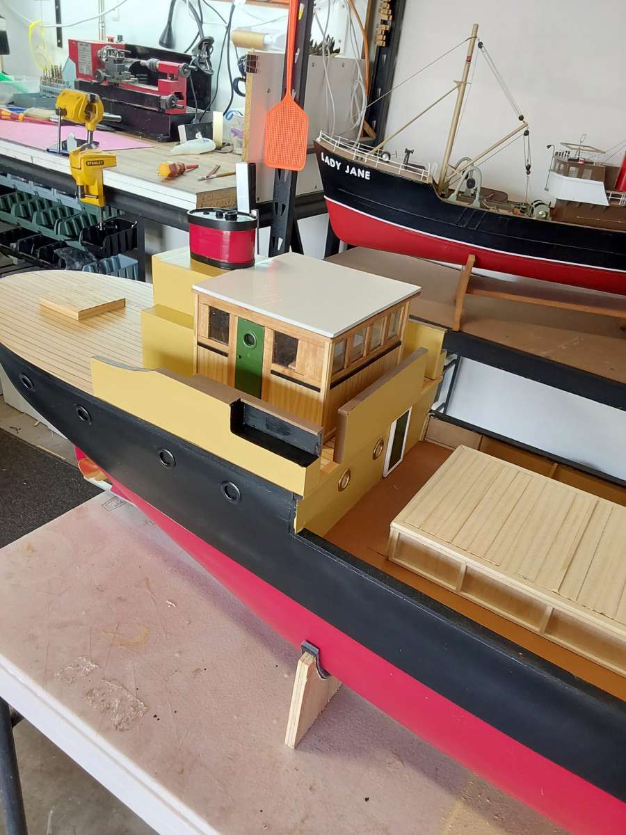
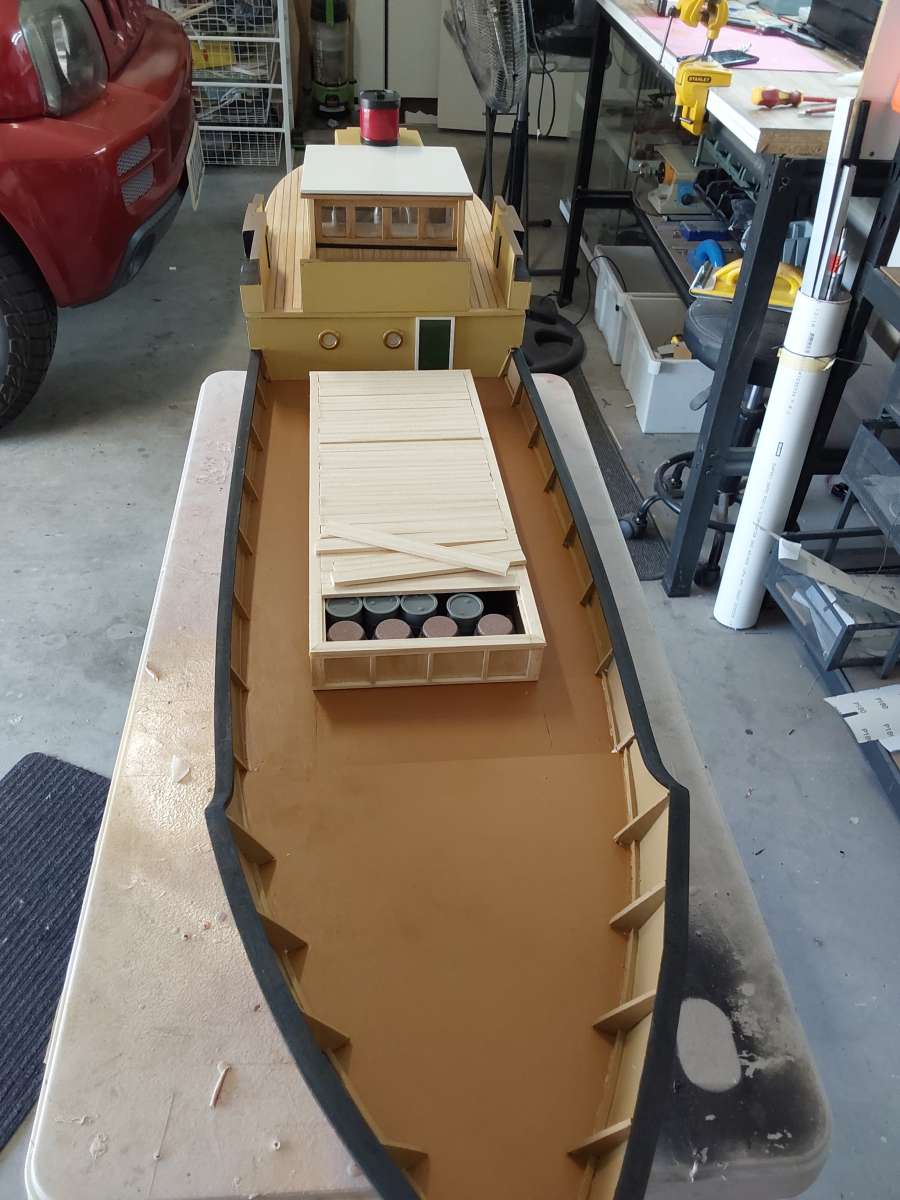
The building the Caroline S.
The building the Caroline S.
- This topic has 16 replies, 8 voices, and was last updated 8 months, 3 weeks ago by
 Richard Simpson.
 mick east
 Ray Wood 3
 Tim Rowe
 Richard Simpson
 John W E
 ashley needham
 Colin Bishop
 Philip Oxley
- Please log in to reply to this topic. Registering is free and easy using the links on the menu at the top of this page.
Code of conduct | Forum Help/FAQs
Latest Replies
-
- Topic
- Voices
- Last Post
-
-
My second RC Boat Build – HMS Campanula, another 1/72 Revell Corvette
Started by:
 suzanner
in: Build Blogs
suzanner
in: Build Blogs
- 2
-
3 hours, 7 minutes ago
suzanner
-
Intro and first RC Boat completion
1
2
Started by:
suzanner
in: Beginners
- 10
-
4 hours, 18 minutes ago
suzanner
-
Nor Star Kingfisher.
Started by:
John Walsh in: Collectors’ corner
- 1
-
9 hours, 34 minutes ago
Will Mason 1
-
Sea Queen By Aerokits 2025
Started by:
harry smith 1 in: Collectors’ corner
- 6
-
2 days, 1 hour ago
Richard Simpson
-
Todays Boating
1
2
…
216
217
Started by:
 ashley needham
in: All things floating
ashley needham
in: All things floating
- 86
-
2 days, 4 hours ago
ashley needham
-
Servo slowers
Started by:
Philip Oxley in: R/C & Accessories
- 2
-
4 days, 8 hours ago
-
Triple-Screw Boat in River in Boston
Started by:
Queequeg Quint in: All things floating
- 6
-
4 days, 23 hours ago
-
Figures
Started by:
Tim Cooper in: All things floating
- 3
-
5 days, 2 hours ago
-
Amazing model photograph
Started by:
Bob Wilson in: All things floating
- 5
-
5 days, 8 hours ago
-
Motor & ESC options for small tug
Started by:
mejt2026 in: Beginners
- 6
-
5 days, 23 hours ago
Richard Simpson
-
Avondale Castle
Started by:
- 1
-
6 days, 7 hours ago
-
Spring 25 as featured in Howards Way from the 1980’s
1
2
Started by:
 Ray Wood 3
in: Sailing Models
Ray Wood 3
in: Sailing Models
- 5
-
1 week ago
Ray Wood 3
-
Eezebilt RAF Fire Boat
1
2
3
4
Started by:
- 8
-
1 week, 2 days ago
-
Krick Felix – first build
Started by:
nighthaunt in: Beginners
- 5
-
2 weeks ago
Richard Simpson
-
Spurn Light Vessel
Started by:
Gareth Jones in: Scratch build
- 5
-
3 weeks, 3 days ago
Richard Simpson
-
Hot Weather
1
2
Started by:
- 6
-
1 month ago
-
superglue allergy
1
2
Started by:
 Alasdair Allan
in: All things floating
Alasdair Allan
in: All things floating
- 9
-
1 month ago
ashley needham
-
Wivenhoe Lass – Fishing Boat – Scale 1/12th
1
2
Started by:
Ray Wood 3
in: Scratch build
- 6
-
1 month ago
Ray Wood 3
-
Vic Smeed’s Silver Mist
1
2
…
39
40
Started by:
Bob Abell 2 in: Scratch build
- 11
-
1 month ago
 Colin Bishop
-
TID Tug
Started by:
Frag 74 in: Build Blogs
- 6
-
1 month ago
Ray Wood 3
-
Favourite Tool
Started by:
- 6
-
1 month, 2 weeks ago
Richard Simpson
-
Costa
Started by:
Stephen Garrad in: All things floating
- 5
-
1 month, 3 weeks ago
-
MV Oldenburg 1/48th scale
1
2
…
4
5
Started by:
Ray Wood 3
in: Scratch build
- 5
-
1 month, 3 weeks ago
Colin Bishop
-
End of the MPBA?
Started by:
Colin Bishop
in: All things floating
- 4
-
1 month, 3 weeks ago
Colin Bishop
-
My Builds and Future Projects
Started by:
 Chris Fellows
in: Build Blogs
Chris Fellows
in: Build Blogs
- 4
-
2 months, 1 week ago
 Boiler Bri
-
My second RC Boat Build – HMS Campanula, another 1/72 Revell Corvette
 John Walsh
  Will Mason 1
 harry smith 1
  Philip Oxley
  Queequeg Quint
  Tim Cooper
  Bob Wilson
  mejt2026
  nighthaunt
  Gareth Jones
  Bob Abell 2
  Frag 74
  Stephen Garrad
 Latest Issue
Newsletter Sign-up
Latest Replies
